Overview
How can a small store add the sections its theme left out?
PROPS is a free library of Shopify sections, the blocks a store’s pages are built from. Each is one file a shop owner pastes into their theme in about two minutes, with no app or developer.
I made the sections, the site and its design system, the install guide and the public code.
Problem
A missing section usually means an app or a developer
When a store needs a section its theme lacks, like a gallery or a before-and-after slider, the usual fixes are a monthly app, a developer’s invoice or a new theme. Brands with design teams absorb that, while small stores often go without.
In January 2026, a store owner on r/shopify asked how to add small galleries “without the need for another 3rd party app or changing themes.”

I shared the code with three steps to install it, and three days later the store owner had their gallery. It’s Gallery Grid in the library today.
The opportunity
What if every missing section were one file you could paste in yourself?
Principles
Three rules make a section easy to add


Solution
Find a section, copy it, paste it in
A shop owner pastes a section into a new file in their theme’s code, and it appears in the theme editor beside the sections the theme came with.
Why one file
A file asks the least of a store
The other ways to add a gallery are an app or a different theme. An app asks for an account, permissions and usually a monthly fee, and a new theme changes every page to fix one.
The tradeoff is updates. An app updates itself, whereas a section is updated by pasting the new file over the old one. Its settings carry over because Shopify stores them separately, and each section page shows when it last changed.
Every option is a setting
Gallery Grid alone has settings for columns, image shape, captions, spacing and colors.
Choosing a section
Shop owners see the real section before they copy it
The library is sorted by what a section does: heroes, galleries, social proof, content and interactive pieces. Each category has its own color on its filter, cards and section pages, so the color tells a shop owner where they are.
Each section page shows the section in several settings and lists what can be changed.
The install guide is written for shop owners rather than developers. It explains theme, section and code editor before anything else, and shows how to practice on a copy of the theme first.
Reports
Every report becomes a public issue
Themes differ, so every section page asks “Clashing with your theme?”
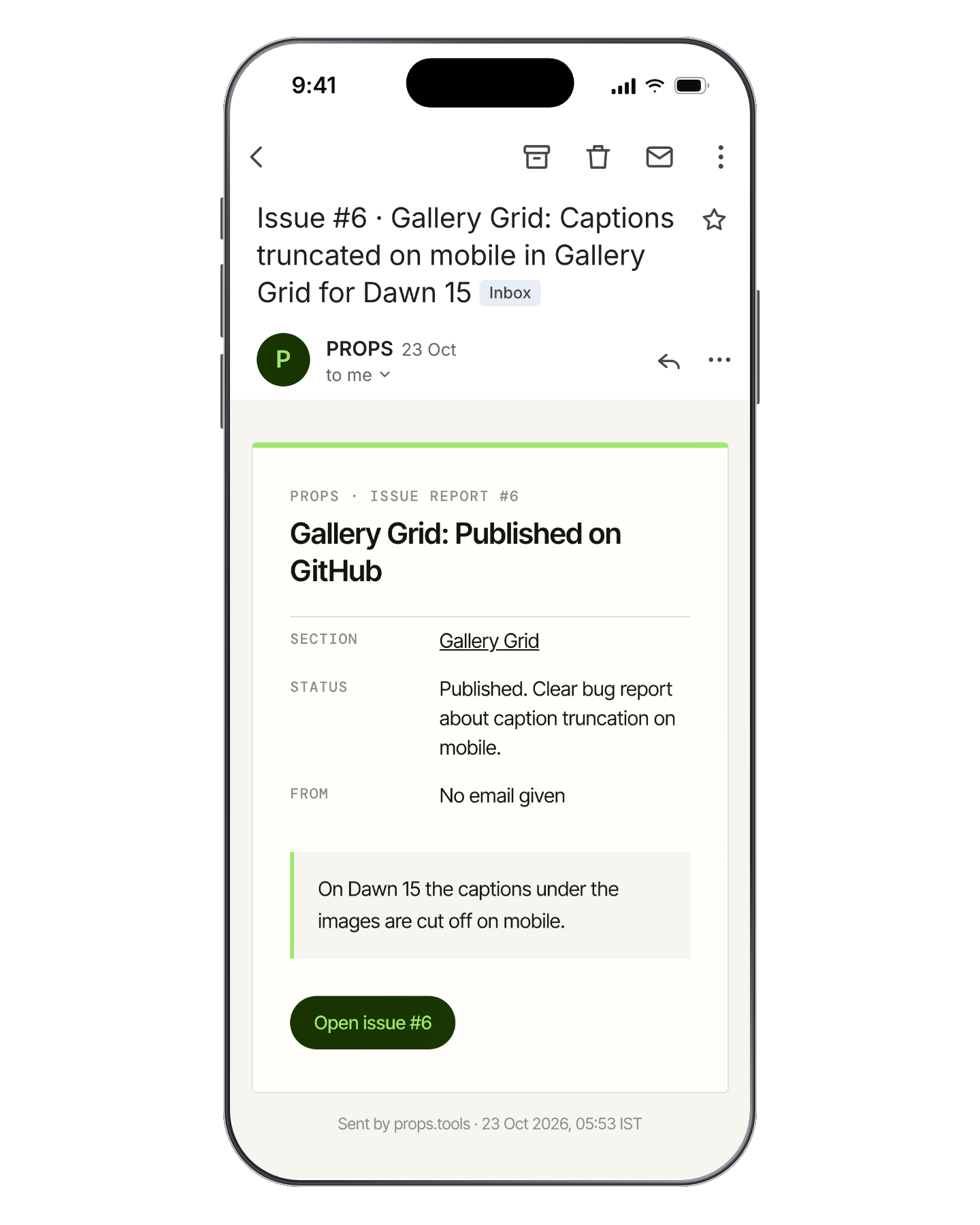
A report opens a public issue on GitHub at once, so the shop owner has a link to follow. While it says “being checked”, a model reads the report, closes it if it’s spam and, if it’s real, gives it a clear title and a label. The report text reaches GitHub only after it passes, and I get an email with the model’s reason.
Design system
A library that looks like the inside of a design tool
Before the sections, PROPS was free icon and illustration packs on the Figma Community, used more than 33,000 times. On props.tools, pages sit on grid paper, headings sit in selection frames with square handles, and sticky notes can be dragged. Lime and forest green lead, with four accent colors, and in dark mode the paper turns charcoal while notes and taped photos stay light.
Outcome
PROPS is live, free and open source
The code is on GitHub under the MIT license, so anyone can use the sections in their own store, in client work or in a theme they sell. Every page on props.tools ends with a button to request a new section.

Reflection
The install is part of the product
A section only helps if a shop owner can add it alone, so the guide, settings and previews got as much care as the code.
Show the real thing
Shop owners decide whether to paste code from what they see, so every preview and guide screen is a capture of the real thing.